CLIENT
Canadian Fashion Retailer
ROLE
Lead Product Designer
SERVICES
User research /
Ideation / Wireframing /
UX/UI Design /
Usability Testing /
User Stories
How might we translate the strong brand identity, rich experience and emotion evoked in the retailer’s physical stores into an online flagship experience?
PRIORITY AREAS
DESIGN PROCESS
Customer Research
We used a mixed-methods approach to identify customer needs, wants, pain points and opportunities. Qualitative and quantitative research were conducted through:
a Google Analytics assessment
a Voice of Customer assessment with the Customer Care Team
an in-store shop-along research
1:1 user research
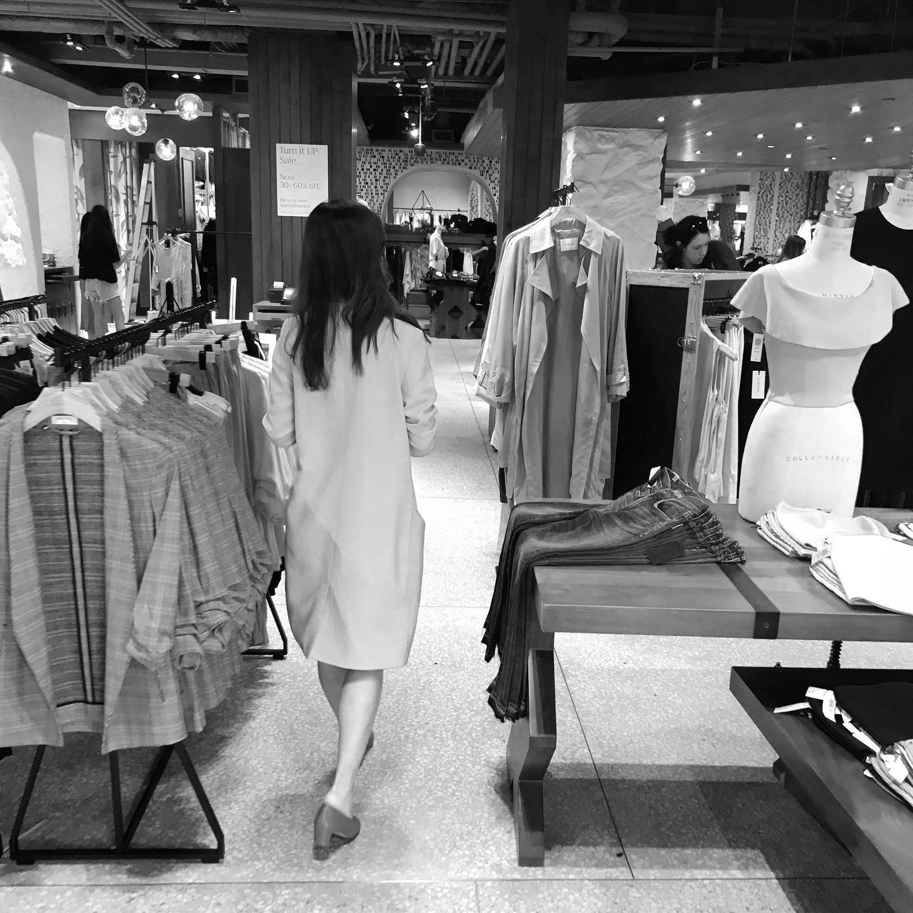
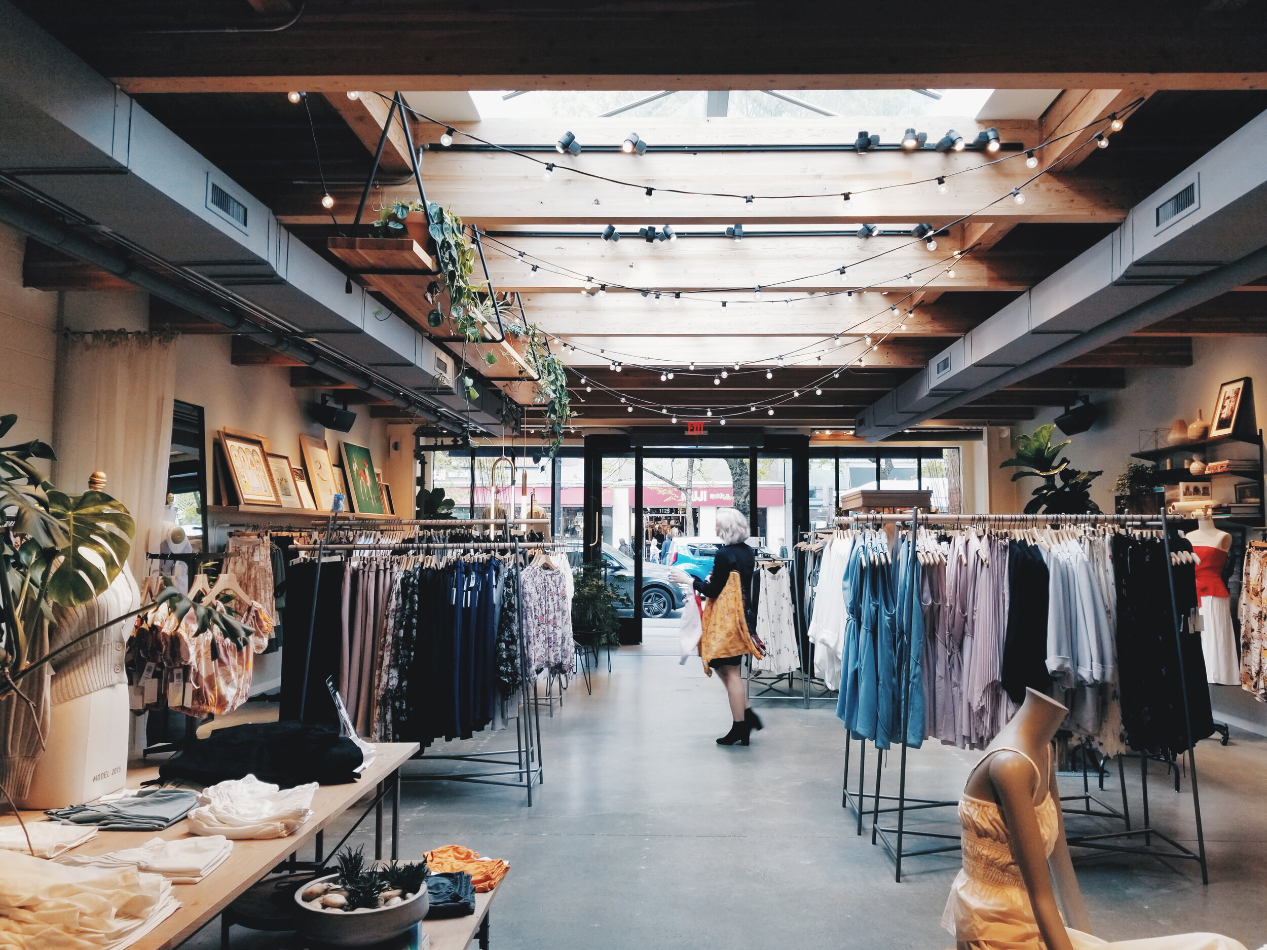
Ethnographic research - I observed customers in stores (with consent) across Canada & the US to understand their shopping behaviours. We also interviewed Style Advisors to understand their experience with providing customer service and how that could be translated online.
1:1 user research - We conducted interviews, usability testing, and card sorting activities to understand customer pain points and information architecture needs.
Discovery & RESEARCH
Business Objectives & Vision
Through a business objectives workshop and several deep dive sessions with the client’s Digital Experience Team, Social Media Team, Customer Care Team, etc., we developed guiding vision statements and principles for each program.
“An inspiring exploration of style while she effortlessly finds what she loves.”
“Offering information she trusts to encourage a confident decision.””
Competitive & Industry Landscape
We also assessed how the retailer stacked up against competitors and usability leaders. We identified opportunities for parity innovation in areas such as: navigation and category listing, search functionalities, and bag/wishlist. We also evaluated the client’s existing website against the Nielsen Norman Group’s ten usability heuristics for user interface design to identify pain points for further research and potential improvement opportunities.
ANALYSIS & PRIORITIZATION
Research Synthesis
Our team synthesized the insights into 9 Discovery Themes. These themes were used as a basis to select 10 Vision Areas to focus on for the Design Phase.
Personas & Experience Map
I also created behavioural personas and an experience map to provide a digestible means of understanding information. These design tools created a shared understanding of customer needs, frustrations and opportunity areas and were used to inform design decisions.
Prioritization
We then conducted prioritization activities with the client’s leadership team to define their digital key performance indicators and business value drivers, including:
Product click rate
Returning visitors
Checkout rate
Add to Bag rate
Add to Wishlist rate
We mapped opportunity areas using an effort / impact matrix and further prioritized the following four vision areas to ideate on and create prototypes for.
4 prioritized vision areas:
Product Listing Page (PLP): She is empowered with the right information on the PLP to guide her exploration.
Product Detail Page (PDP): She understands the product story which builds confidence in her decision.
Bag / Wishlist: She seamlessly saves items and selects her favourites for purchasing.
Information Architecture (IA) Structure and Labelling: She intuitively understands how items are grouped and labelled to encourage exploration.
Prototyping
I created prototypes for the vision areas through frequent co-creation and design review sessions with the client’s Digital Experience Team. Idea generation and development included a mixture of divergent and convergent activities, to see the solution space from different angles, which helped us not get stuck in a narrow frame of possibilities.
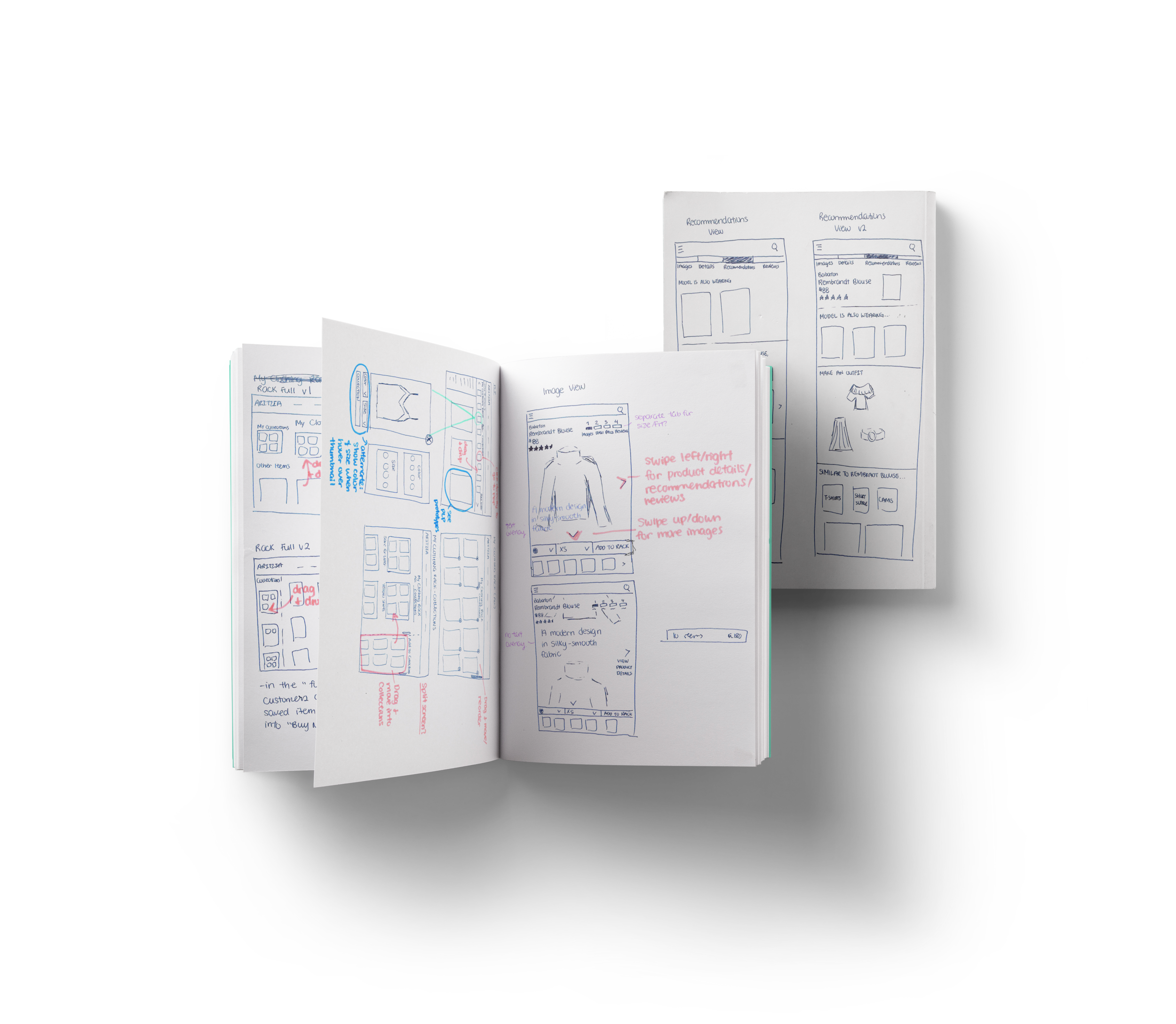
Paper sketches
I started by sketching out wireframes for the selected concepts. developing paper prototypes for selected concepts.
Wireframes & Information Architecture
After a few rounds of feedback with the client, we selected a few ideas to move forward with. I created low-fidelity wireframes & information architecture variations to test with the customers.
Testing
Design Concept Testing
Core aspects of designs tested:
New PLP to PDP flow to create a more seamless connection between product list and details
Easier way to save or buy an item from any point in the journey
Different views of products, navigation tools, and wayfinding
What information she needs and when to help her make decisions
How she likes to manage and evaluate products she has saved and continue to purchase
Information Architecture Testing
We simultaneously conducted tree tests and card-sorting activities to test the navigation variations.
Iterations & Final Designs
After testing our initial concepts, we diverged the design work into two separate paths – The Ambition Concepts and the Minimum Viable Product (MVP) Designs.
I. Ambition Concepts
The Ambition Concepts targeted all 10 vision areas. Their purpose was to create the overall visionary future state and included longer-term revolutionary futures.
II. MVP Designs
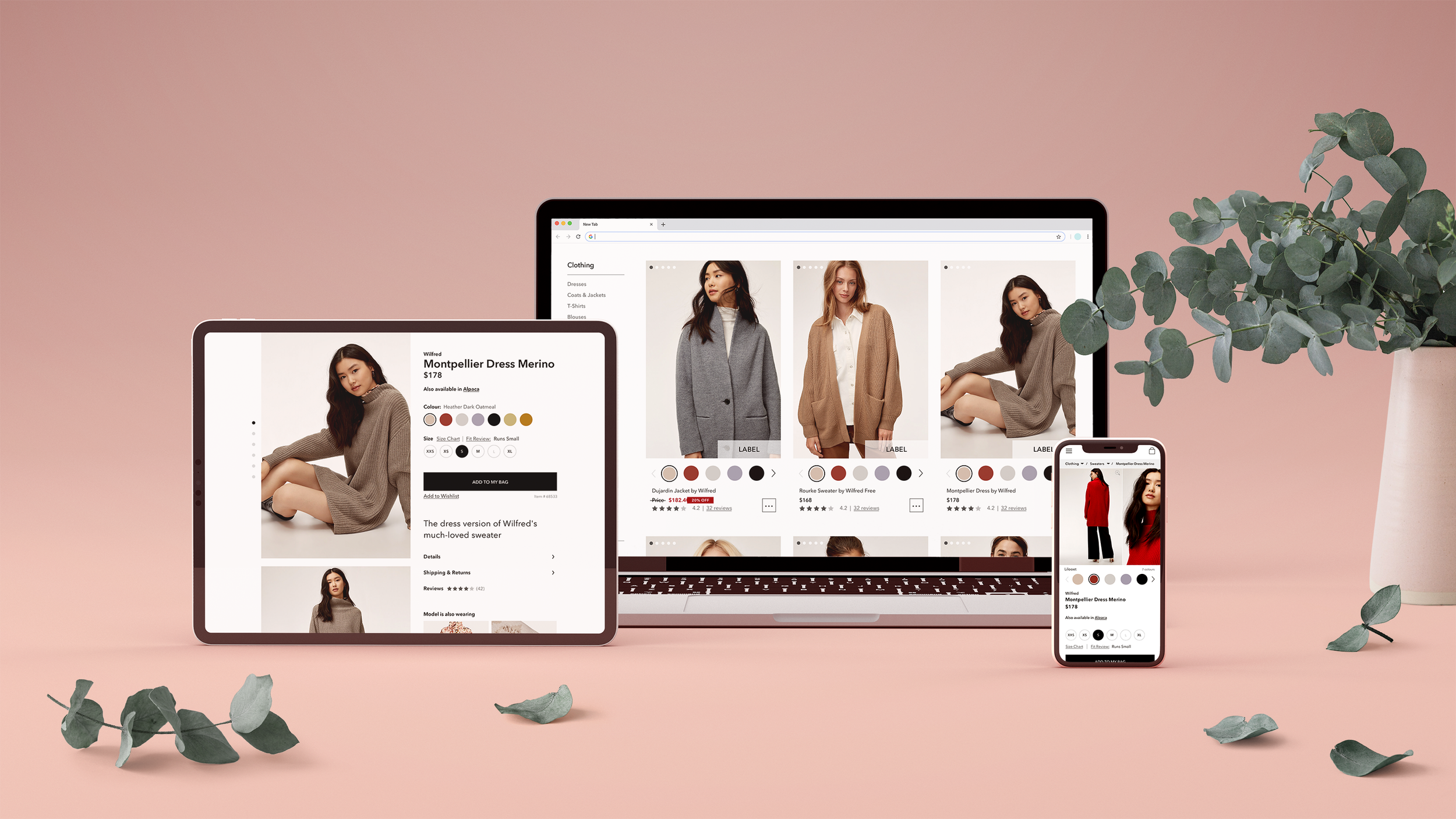
Meanwhile, the MVP Designs took inspiration from the Ambition Concepts and stayed closer to the current site. They were shorter-term incremental innovations that could be implemented immediately. Focusing on the four prioritized vision areas, I created high-fidelity designs that incorporated the retailer’s style guide.
Handoff TO DEVELOPMENT
I created JIRA backlog tickets for sprints, which each contained a detailed user story, the problem(s) the design addressed, research feedback, solution details, acceptance criteria and annotated wireframes for each of the MVP Design features. We also created roadmaps that mapped out the timeline of the initiatives and activities.
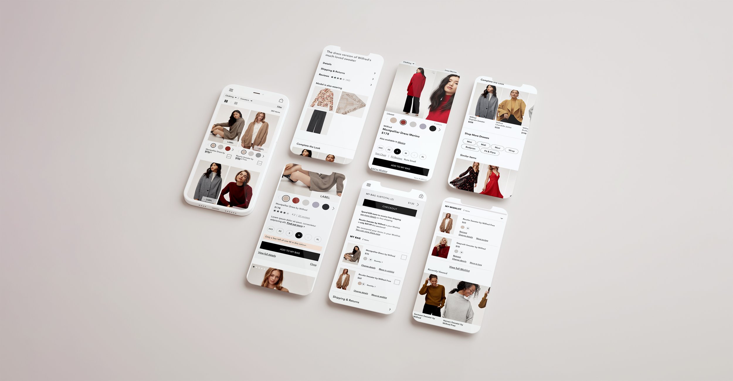
Highlights of Design Features:
Product Listing Page (PLP)
Product availability: She wants to see product availability and colour options earlier on, so swatches are shown on the PLP. We also created a “Quickview” that displays stock availability.
Mobile image sizes: She wants larger images to see product details, so we created a 1-column and 2-column view for her to alternate between.
Product Detail Page (PDP)
Product details: She likes knowing the story behind the product to help her make her decision so we restructured the flow and display of content on the PDP to better convey the product story.
Recommendations: She sees the retailer as fashion inspiration, so we surfaced other items worn by the model in the product image.
Bag/Wishlist
Selective checkout: She likes to save items for later but does not use the wishlist due to sign up barrier and lack of awareness. With a selective checkout, she can add items all into one space, select items to check out and leave the rest to return to later.
IA Structure and Labelling
We provided options for navigation variations and suggested next steps, including: understanding why she gets lost on the '“New” page, re-ordering L1 items, further categorizing “Features”, and incorporating imagery as part of the navigation menu.

IMPACT
Prior to this engagement, the retailer had never spoken with their customers to understand their needs and pain points. This engagement helped them develop knowledge and skills around taking a customer-centred approach to their design work, and will ultimately help them achieve their identified KPIs, such as sales, product click rate, and checkout rate.
SKILLS DEVELOPED
Ethnographic research
User testing on UserZoom
Collaboration with product & dev teams
INSIGHTS
Relate designs back to customer research, agreed priorities, and business KPIs to support design decisions and get buy-in from stakeholders.
Make sure everyone understands how a specific screen fits in with the overall user flow.
Involve the Development and Merchandising team when early concepts are developed to ensure there are no surprises during handoff.


